In today’s world, where the use of smartphones and tablets has become ubiquitous, responsive web design has become a necessity. With so many people accessing the internet from a wide range of devices, it’s essential for websites to be optimized for all screen sizes. It allows websites to adjust to the size of the device they’re being viewed on, ensuring that the user experience is consistent across all devices. In this blog, we’ll explore what it is, its benefits, and how it works.
What is Responsive Web Design?
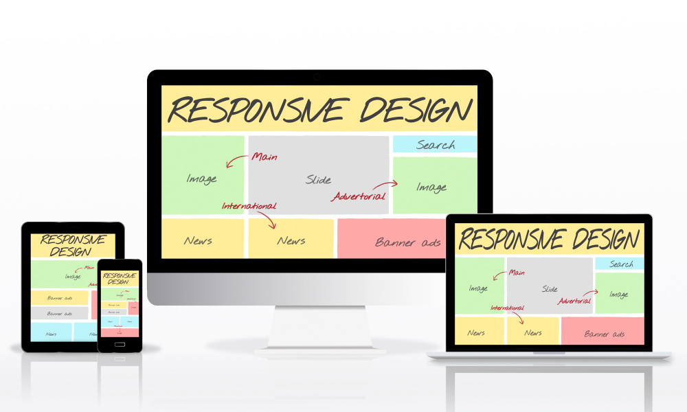
Responsive web design is an approach to web development that allows websites to adapt to different screen sizes and resolutions. The goal is to provide a consistent user experience across all devices, whether it’s a desktop computer, a tablet, or a smartphone. With responsive web design, a website’s layout, content, and images are optimized for each device, ensuring that the site looks great and functions well, no matter what device it’s being viewed on.
Benefits of Responsive Web Design
The benefits of its are numerous. Perhaps the most significant benefit is that it allows websites to reach a wider audience. With so many people using smartphones and tablets to access the internet, it ensures that websites can be viewed on any device, making them more accessible to a wider range of users.
Responsive web design also provides a better user experience. When a website is optimized for the device it’s being viewed on, users can easily navigate the site, read content, and interact with the site’s features. This means that users are more likely to stay on the site longer, engage with the content, and ultimately convert into customers or clients.
Responsive web design also has SEO benefits. Google has stated that responsive web design is their recommended approach for building mobile-friendly websites. Websites that are optimized for all devices are more likely to rank higher in search engine results, which can lead to increased traffic and more leads.
How Does Responsive Web Design Work?
Responsive web design works by using a combination of flexible layouts, flexible images, and media queries. Let’s take a closer look at each of these components.
Flexible Layouts
One of the key components of responsive web design is the use of flexible layouts. Instead of using fixed-width layouts, which are designed for a specific screen size, it uses fluid grids that can adjust to any screen size. This means that as the screen size changes, the layout of the website changes as well, ensuring that the content is always easy to read and navigate.
Flexible Images
Another key component of it is the use of flexible images. Images that are optimized for one screen size may not look great on another screen size, so it’s important to use images that can adjust to different screen sizes. This can be achieved by using CSS to set the maximum width of the image, which allows the image to scale down as the screen size gets smaller.
Media Queries
Finally, responsive web design uses media queries to detect the size of the device being used and apply the appropriate styles to the website. Media queries allow developers to specify different CSS rules for different screen sizes, ensuring that the website looks great and functions well on all devices.
Conclusion
Responsive web design is a crucial component of modern web development. With so many people using smartphones and tablets to access the internet, it’s essential for websites to be optimized for all screen sizes. It allows websites to adapt to different devices, providing a consistent user experience across all devices. This approach also provides a range of benefits, including improved SEO, increased traffic, and better user engagement. If you’re developing a website, it’s essential to ensure that it’s optimized for all devices using it techniques.
ThirdEssential IT Solutions is a leading software development company based in Indore, India. Established in 2016, the company has grown to become a trusted partner for businesses looking for reliable and innovative technology solutions. With a team of highly skilled developers, designers, and project managers, ThirdEssential IT Solutions has been able to deliver high-quality software products and services to clients across various industries.
At ThirdEssential IT Solutions Company in Indore, we believe that technology can transform businesses, and we are dedicated to helping our clients leverage technology to achieve their business goals. We offer a wide range of services, including software development, web development, mobile app development, digital marketing, and IT consulting. Our team of experts works closely with clients to understand their unique business needs and develop custom solutions that align with their goals.